x <- c(2,3,5,-1,0)3 Descriptive Statistics
3.1 Descriptive statistics for quantitative variable: numerical summary
3.1.1 mean, variance, sd, median
Let \(x = (x_1, x_2, \cdots, x_n)\), then \[\bar x=\frac{1}{n}\sum_{i=1}^nx_i\] is the mean of \(x\). Use mean().
median of \(x\) is the middle value after sorting \(x\) from smallest to biggest. Use median().
Variance of \(x\) describes the variation/spread of data/sample \(x\) and is \[var(x)=\frac{1}{n-1}\sum_{i=1}^{n}(x_i-\bar x)^2.\] Use var().
Standard deviation of \(x\) is \[sd(x)=\sqrt{var(x)}.\] Use sd().
By the way, since all these are calculated from the data/sample x, they are also called sample mean, sample variance, sample standard deviation.
sum(x)/length(x)[1] 1.8mean(x)[1] 1.8median(x)[1] 2var(x)[1] 5.7my_var <- sum((x - mean(x))^2) / (length(x) - 1)
my_var[1] 5.7my_sd <- sqrt(my_var)
my_sd[1] 2.387467sd(x)[1] 2.3874673.1.2 Quantile (percentile)
qth percentile of a dataset/sample is the number such that q% of the data is below this number. For example, Q1 = 25th percentile = the number such that a quarter of the data is below it. Obviously, Q2 = 50th percentile = median.
rate <- CO2$uptake
quantile(rate, 0.3)
30%
18.9 This means 30% of all values are below 18.9.
The following gives min, Q1, Q2 (median), Q3, max
quantile(rate) 0% 25% 50% 75% 100%
7.700 17.900 28.300 37.125 45.500 summary() also provides mean in addition to what’s provided in quantile()
summary(rate) Min. 1st Qu. Median Mean 3rd Qu. Max.
7.70 17.90 28.30 27.21 37.12 45.50 3.2 Descriptive Statistics for quantitative variable: graphing
3.2.1 Histogram
For a quantitative/numerical variable, a good way to visualize it is to draw its histogram. We already have learned this in Section 1.10.2 using hist(). From now on, we will try to draw all plots using ggplot().
library(ggplot2)
class(mpg$displ)
[1] "numeric"Again, we can only draw histogram of a numerical variable.
ggplot(data = mpg,
       mapping = aes(x = displ)) +
  geom_histogram(binwidth = 0.3) +
  labs(x = "Engine Displacement (litres)")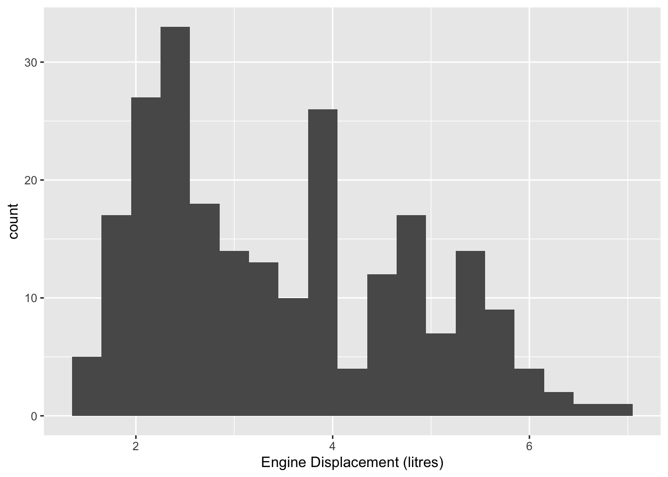
It is easy to change colors of the histogram.
p1 <- ggplot(data = mpg,
       mapping = aes(x = displ)) +
  geom_histogram(binwidth = 0.3,
                 color = "black",
                 fill = "gray") +
  labs(x = "Engine Displacement (litres)")
p1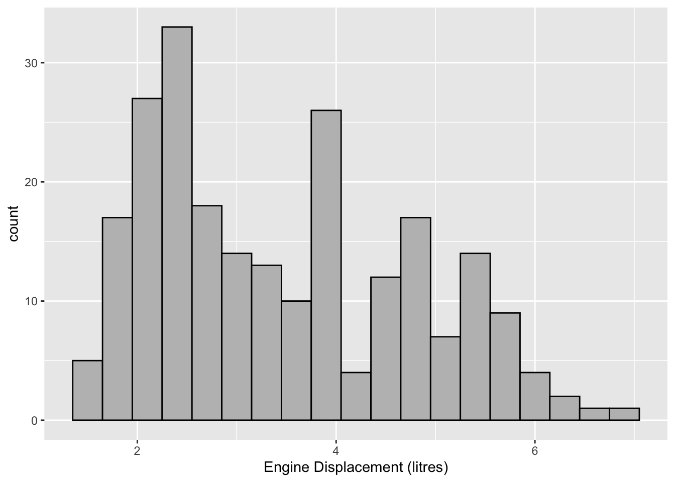
If we want to change the x axis ticks, we use scale_x_continuous(breaks = ) since the x-axis here is continuous.
p1 + scale_x_continuous(breaks = seq(0, 7, 1))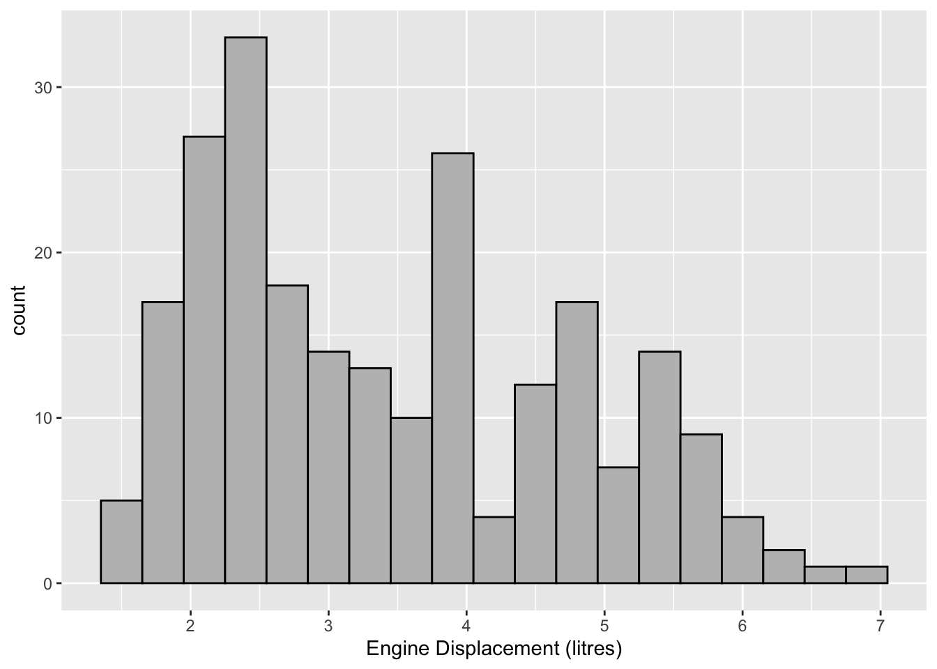
3.2.2 A tip on color
Run “colors(distinct = FALSE)” will give you a list of viable color names in R. You can see what these colors look like on This site.
ggplot(data = mpg,
       mapping = aes(x = displ)) +
  geom_histogram(binwidth = 0.3,
                 color = "black",
                 fill = "seagreen")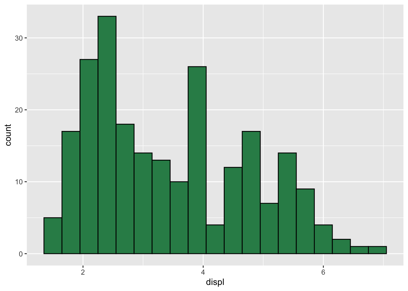
Finally, we can always define our own color if we know its RGB values.
uncw_blue <- rgb(15, 44, 88, maxColorValue = 255)
uncw_yellow <- rgb(243, 196, 66, maxColorValue = 255)ggplot(data = mpg,
mapping = aes(x = displ)) +
geom_histogram(binwidth = 0.3,
color = uncw_blue,
fill = uncw_yellow)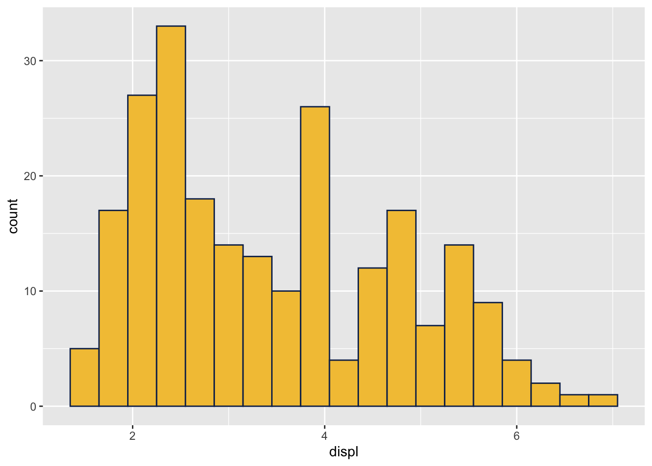
Notice the following produces the same plot as above (other than coloring), which means the default in geom_histogram() is to draw counts of each bin.
ggplot(data = mpg,
       mapping = aes(x = displ)) +
  geom_histogram(aes(y = after_stat(count)),
                 binwidth = 0.3)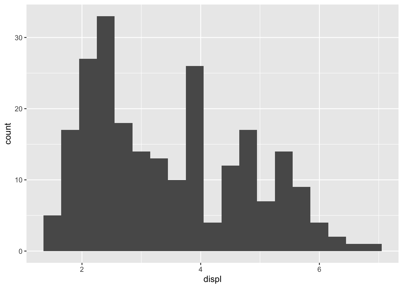
Change counts to density in the histogram: Sometimes we want to rescale the counts so that the histogram represents the probability density function. (This means total area of all bars add up to 1.)
ggplot(data = mpg,
       mapping = aes(x = displ)) +
  geom_histogram(aes(y = after_stat(density)),
                 binwidth = 0.3,
                 color = "black",
                 fill = "peru")+
  geom_density()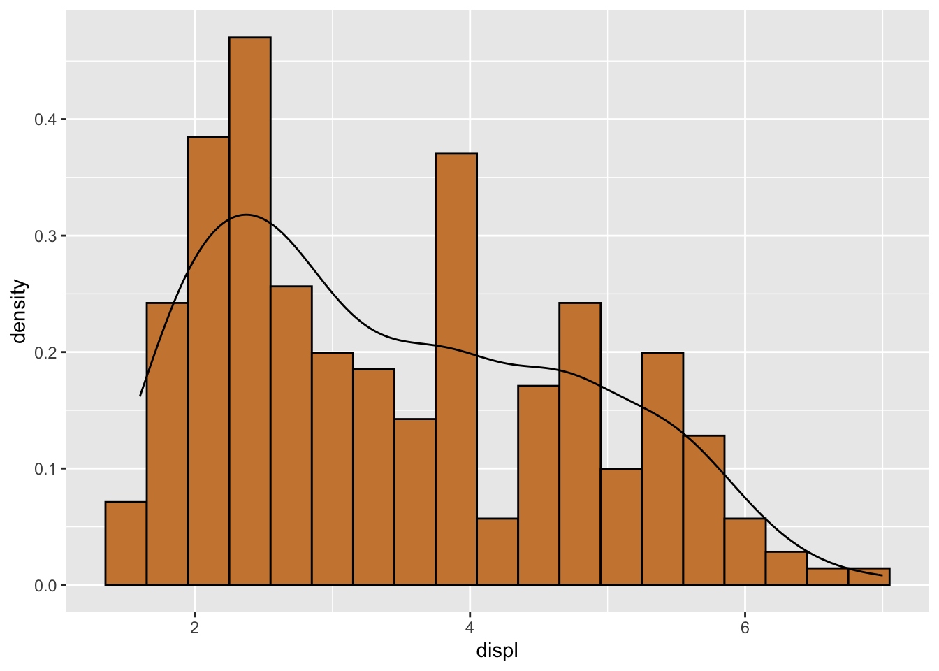
3.2.3 Box plot
A box plot also gives a great visualization of a numerical variable.
ggplot(data = mpg, aes(x = displ)) +
  geom_boxplot()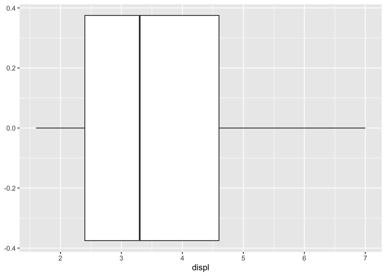
For a box plot, the y axis is meaningless and it is a good idea to get rid of the yticks.
ggplot(data = mpg, aes(x = displ)) +
  geom_boxplot() +
  scale_y_continuous(labels = NULL)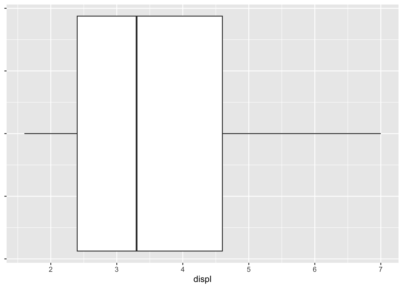
A better way to get rid of ticks is to use theme(). See Section 3.2.4.
In the histogram of displ, it has a longer right tail. This is also reflected in its box plot where the right half of the box is longer. Both plots indicate that the data is skewed to the right.
3.2.3.1 How a box plot is produced
The box plots drawn in many software (like Excel or R) by default factor in outliers. Let Q1 be the 25th percentile and Q3 be the 75th percentile, then IQR = Q3 - Q1. An outlier is a number outside of reg_range = [Q1-1.5*IQR, Q3+1.5*IQR]. In a box plot, the three lines of the box are Q1, Q2, Q3. The ends of the whiskers are the min and max values inside this reg_range.
We will try mpg$cty as an example.
ggplot(data = mpg, aes(x = cty)) +
  geom_boxplot()
mc <- mpg$cty
Q1 <- as.numeric(quantile(mc, 0.25))
Q3 <- as.numeric(quantile(mc, 0.75))
IQR <- Q3 - Q1
upper_l <- Q3 + 1.5*IQR
lower_l <- Q1 - 1.5*IQR
# this is the "max" shown in box plot
max(mc[which(mc <= upper_l)])[1] 26# this is the "min" shown in box plot
min(mc[which(mc >= lower_l)])[1] 9The outliers:
mc[-which(mc <= upper_l & mc >= lower_l)][1] 28 28 33 35 293.2.4 More tips on ggplot2
The theme() function is very powerful in changing the appearence of the plots. Below is an example on changing background color and line patterns, as well as eliminating y-axis texts.
ggplot(data = mpg,
       mapping = aes(x = cty)) +
  geom_boxplot(width = 1) +
  theme(panel.background = element_rect(fill = "white",
                                        linetype = 4,
                                        color = "black"),
        panel.grid.major = element_line(color = "lightblue", linewidth = 0.5,
                                        linetype = 1),
        panel.grid.minor = element_line(color = "peru", linewidth = 0.5,
                                        linetype = 2
                                        ),
        axis.ticks.y = element_blank(),
axis.text.y = element_blank()) 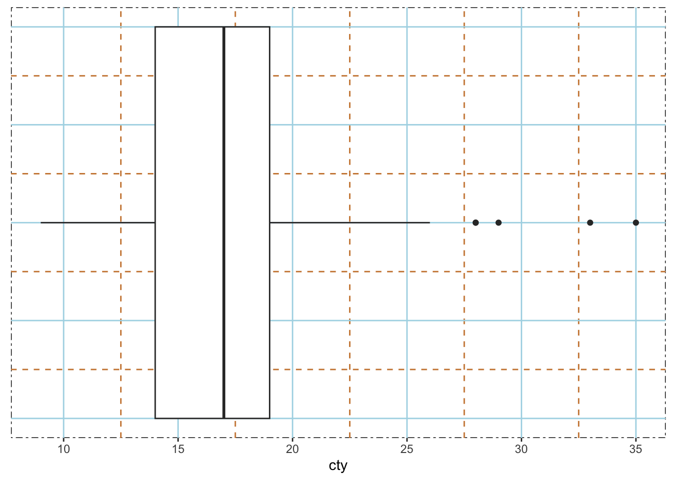
3.3 Descriptive Statistics for categorical variables: frequency table and graphing
The table() function provides counts of each category.
table(mpg$drv)
  4   f   r
103 106  25
3.3.1 Bar charts
ggplot(data = mpg,
       mapping = aes(x = drv)) +
geom_bar(color = "black", fill = "gray") 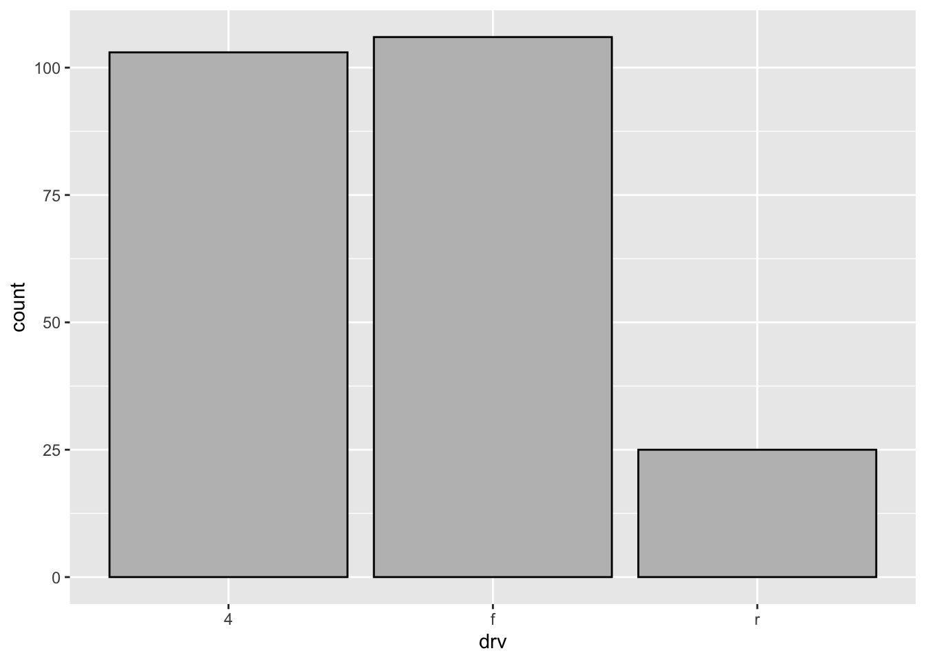
Notice that the ordering of the bars is the same as the output of table(mpg$drv). This is not a coincidence.
It is natural for us to change the labeling of each bar to make it more descptive.
ggplot(data = mpg,
       mapping = aes(x = drv)) +
  geom_bar(color = "black", fill = "gray") +
  scale_x_discrete(name = "type of drive train",
                   labels = c("4 wheel","front","rear"))
3.3.1.1 Add text (counts) to each bar:
bar_text <- ggplot(data = mpg,
       mapping = aes(x = drv)) +
  geom_bar(color = "black", fill = "gray") +
  scale_x_discrete(name = "type of drive train",
                   labels = c("4 wheel","front","rear")) +
  geom_text(aes(label = after_stat(count)),
            stat = "count",
            vjust = - 0.5)
bar_text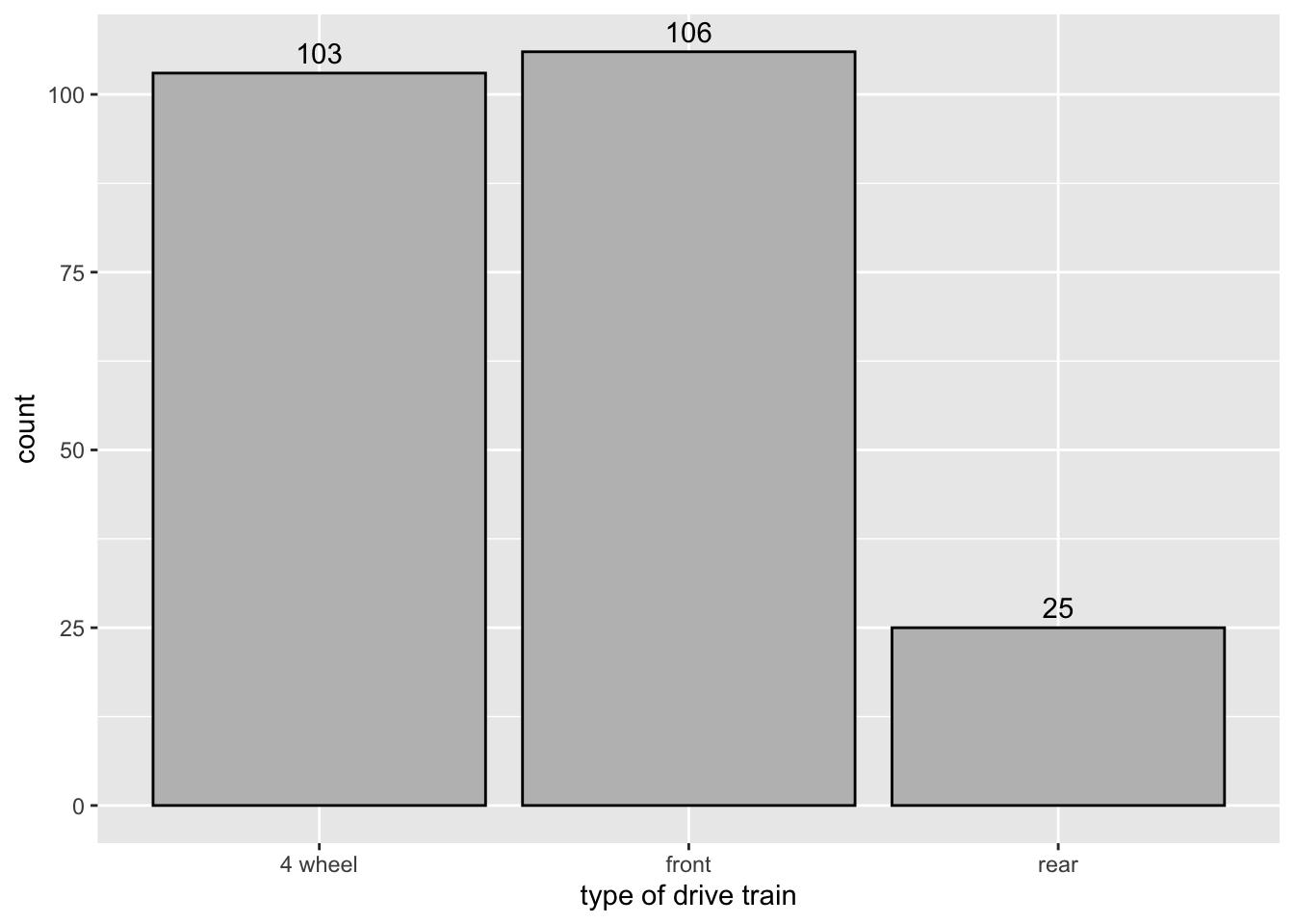
after_stat(count) tells ggplot() to use the internal count instead of looking for it in the work space.
Notice the text “106” is cut off a little bit. Here is how to fix it.
bar_text + scale_y_continuous(limits = c(0, 110))
3.3.1.2 Change text from counts to proportions:
ggplot(data = mpg,
       mapping = aes(x = drv)) +
  geom_bar(color = "black", fill = "gray") +
  scale_x_discrete(name = "type of drive train",
                   labels = c("4 wheel","front","rear")) +
  geom_text(aes(label = round(after_stat(count)/sum(after_stat(count)), 2)),
            stat = "count", vjust =  - 0.5) +
  scale_y_continuous(limits = c(0, 110))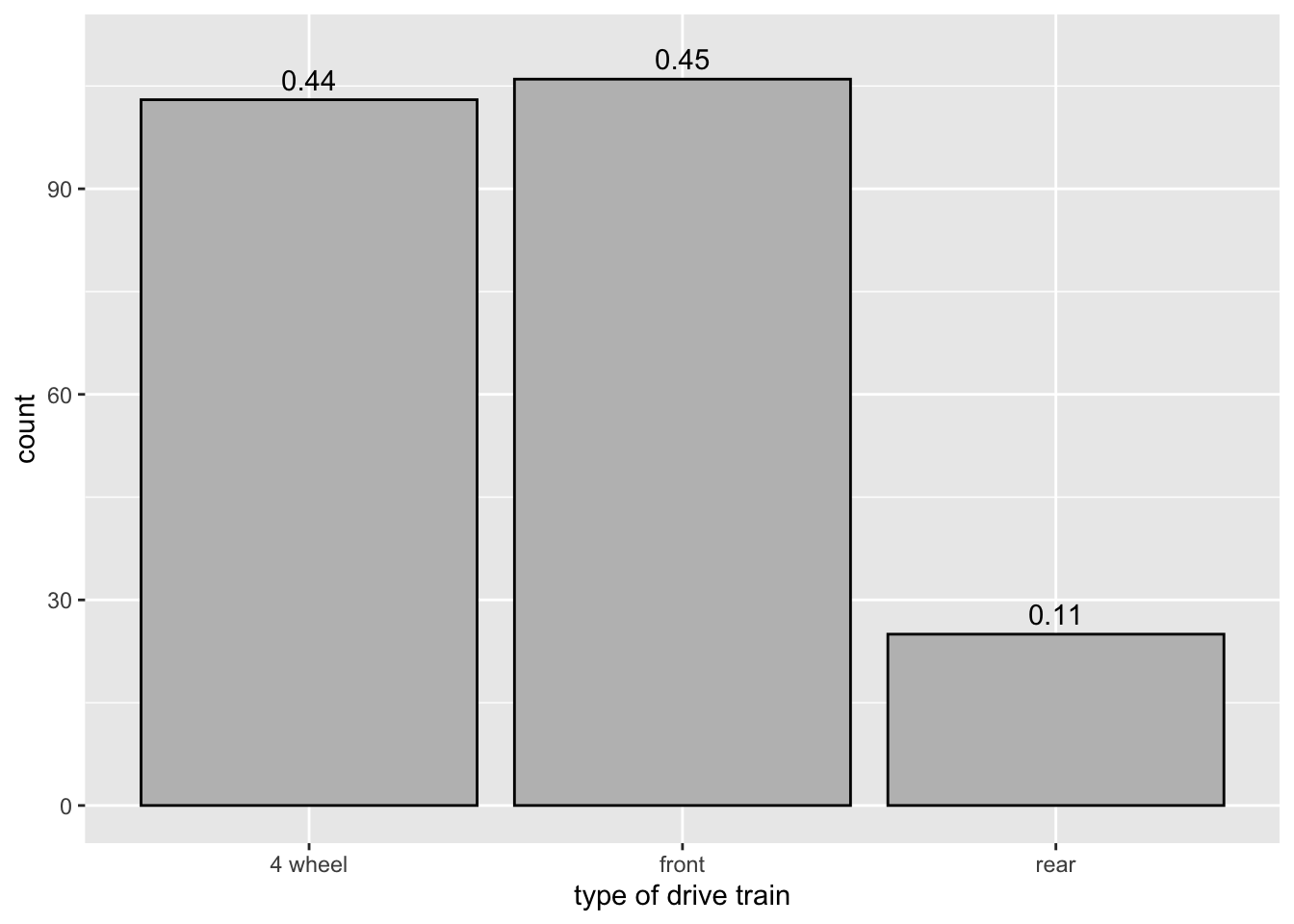
3.3.1.3 Change order of bars
Use scale_x_discrete(limits = ) to change the order of bars.
ggplot(data = mpg,
       mapping = aes(x = drv)) +
  geom_bar(color = "black", fill = "gray") +
  scale_x_discrete(name = "type of drive train",
                   limits = c("f", "4", "r"),
                   labels = c("front", "4 wheel", "rear"))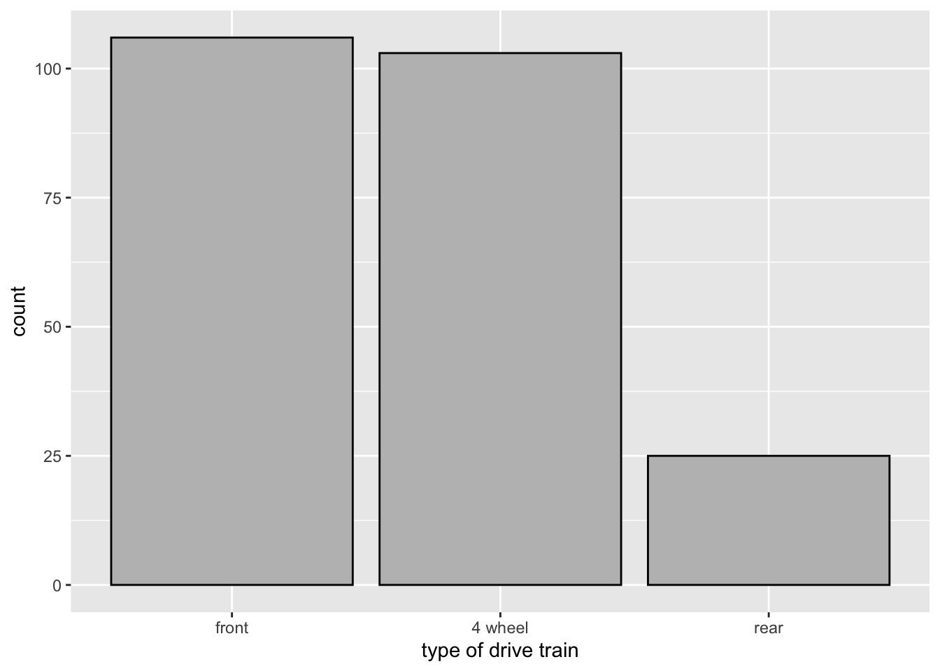
3.4 Relationship between two numerical variables
3.4.1 Scatterplot
See Section 2.1.
3.4.2 Correlation coefficient
The correlation coefficient of two numerical variables is a value that measures the linear relationship between them. Let \(x = (x_1, x_2, \cdots, x_n), y = (y_1, y_2, \cdots, y_n)\), then \[cor(x,y) = \frac{\sum_{i=1}^n(x_i-\bar x)(y_i - \bar y)}{\sqrt{\sum_{i=1}^n (x_i-\bar x)^2}\sqrt{\sum_{i=1}^n (y_i-\bar y)^2}},\] where \(\bar x, \bar y\) are mean(x) and mean(y) respectively (as usual).
In terms of linear algebra/geometry, \(cor(x, y) = \cos(angle\ between\ x-\bar x\ and\ y-\bar y)\).
- \(-1\leq cor(x, y)\leq 1\).
- Negative value means negative correlation. Positive value means positive correlation.
- close to -1 value means strong negative correlation.
- close to 1 value means strong positive correlation.
3.4.2.1 A simulated example
set.seed(2)
x1 <- rnorm(20)
x2 <- 3*x1 + 1
x3 <- rnorm(20)
x4 <- -20.4*x1 + x3
x1 and x2 have a perfect positive linear relationship.
cor(x1, x2)[1] 1#install.packages("gridExtra")
library("gridExtra")use grid.arrange() to draw a grid of plots: scatter(x1,x2), scatter(x1,x3), scatter(x1,x4)
df <- data.frame(x1, x2, x3, x4)
p1 <- ggplot(data = df,
             mapping = aes(x = x1, y = x2)) + geom_point()
p2 <- ggplot(data = df,
             mapping = aes(x = x1, y = x3)) + geom_point()
p3 <- ggplot(data = df,
             mapping = aes(x = x1, y = x4)) + geom_point()
grid.arrange(p1, p2, p3, ncol = 3)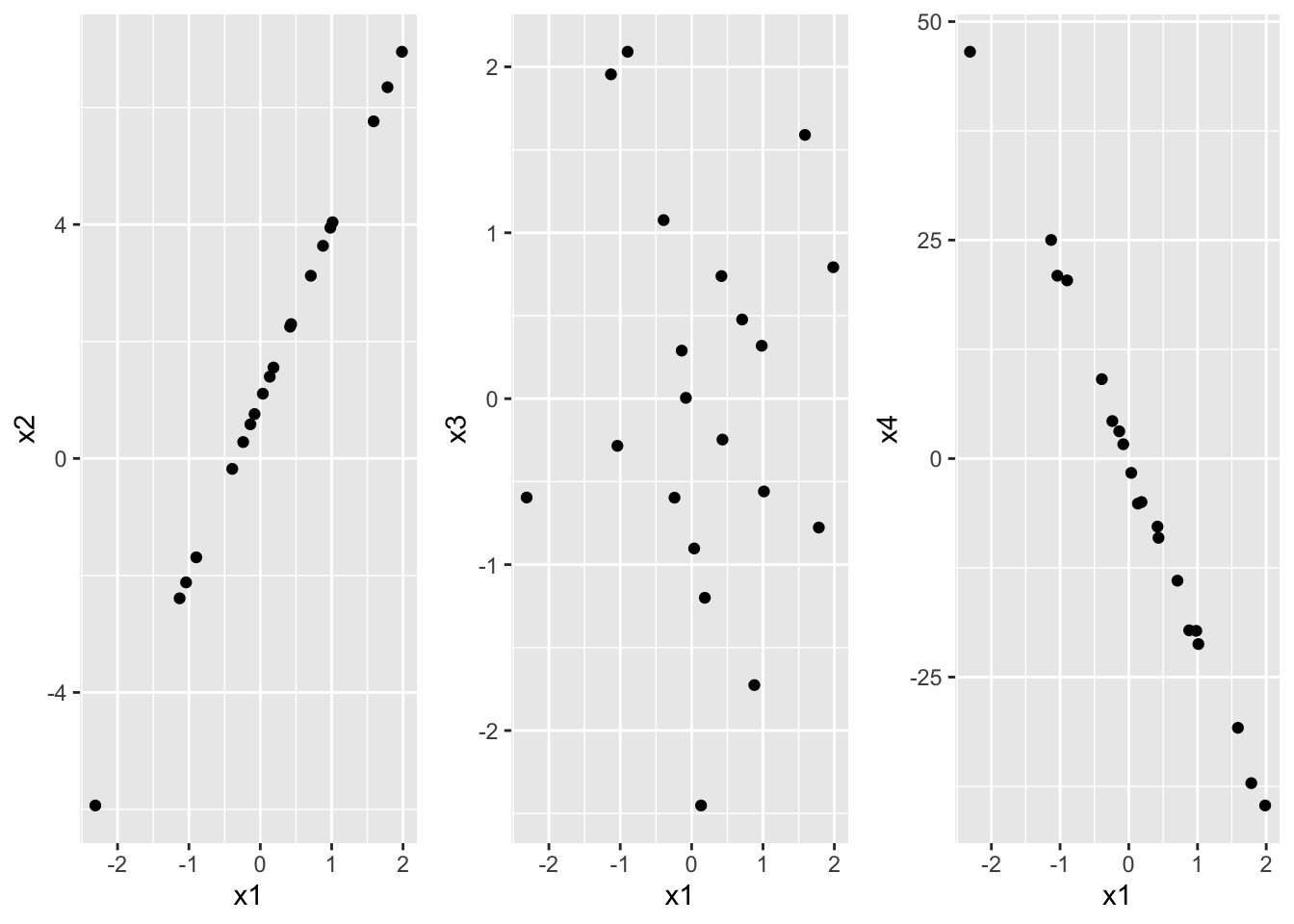
cor(df) x1 x2 x3 x4
x1 1.00000000 1.00000000 -0.07700414 -0.9985304
x2 1.00000000 1.00000000 -0.07700414 -0.9985304
x3 -0.07700414 -0.07700414 1.00000000 0.1309247
x4 -0.99853039 -0.99853039 0.13092471 1.0000000correlation coeff not good at detecting non-linear relationship.
x5 <- x1^2
cor(x1,x5)
[1] 0.021221763.5 Relationship between one numerical and one categorical
ggplot(data = mpg, mapping = aes(x = drv, y=cty)) +
  geom_boxplot() +
  scale_x_discrete(name ="Type of drive train",
                  labels = c("4 wheel","front wheel","rear wheel"))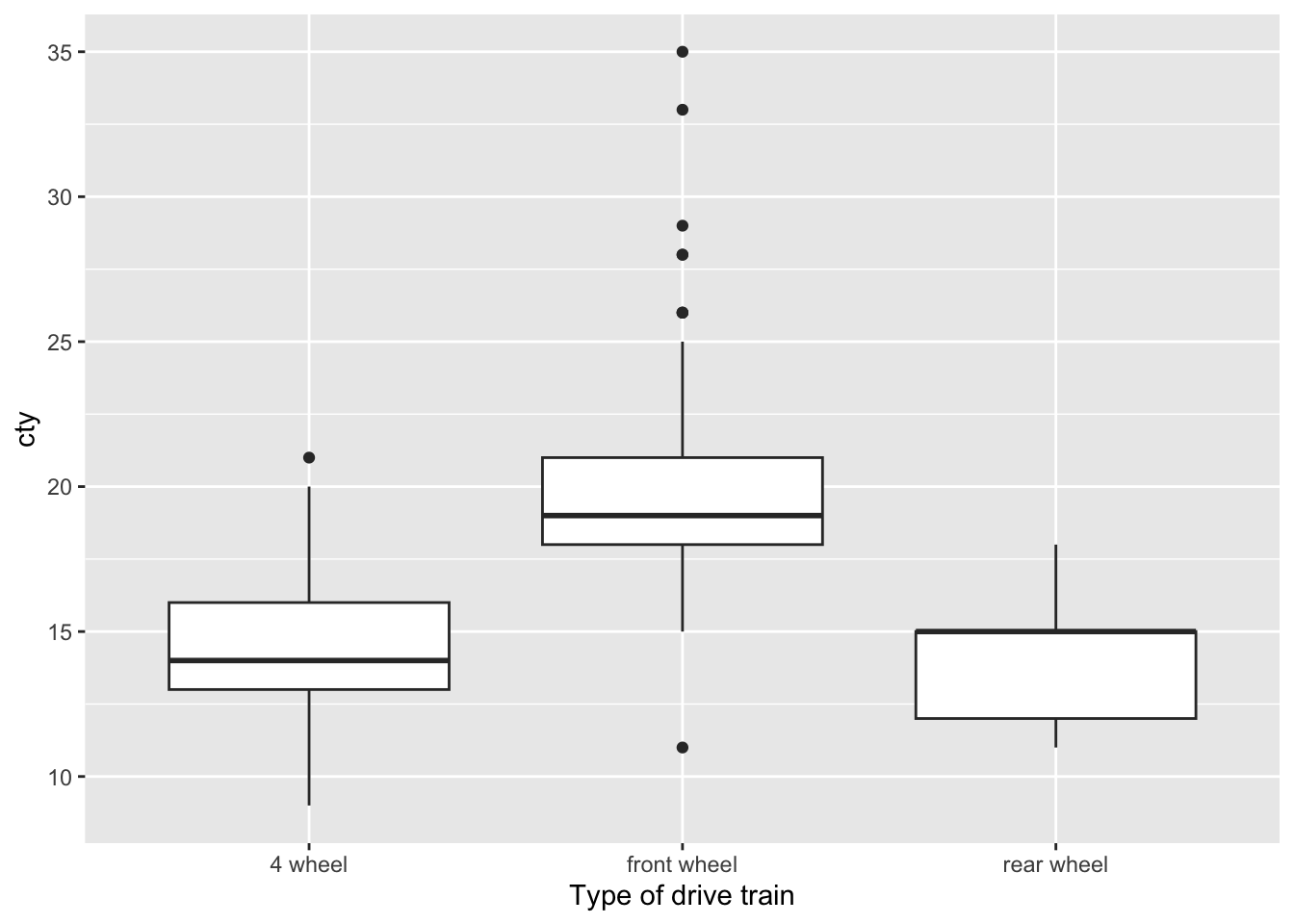
reordering
ggplot(data = mpg, mapping = aes(x = drv, y=cty)) +
  geom_boxplot() +
  scale_x_discrete(name ="Type of drive train",
                   limits = c("f","r","4"),
                  labels = c("front wheel","rear wheel","4 wheel"))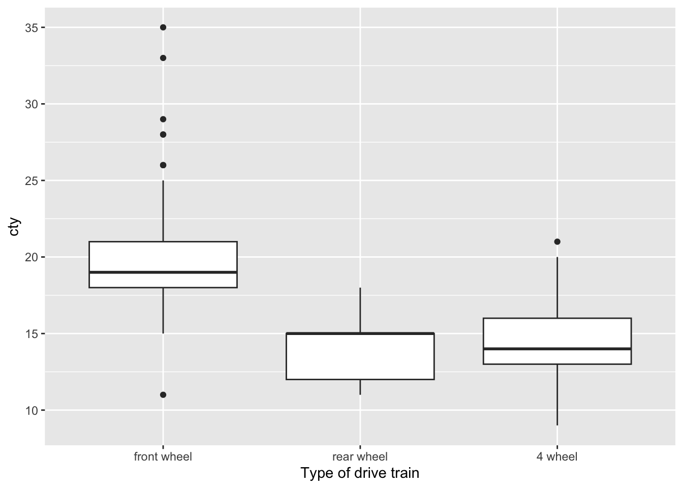
ggplot(data = mpg,
       mapping = aes(x = cty, color = drv)) +
  geom_density(linewidth = 0.75)
3.6 Relationship between two categorical variables
stacked bar
ggplot(mpg, aes(x = class, fill = drv)) +
  geom_bar()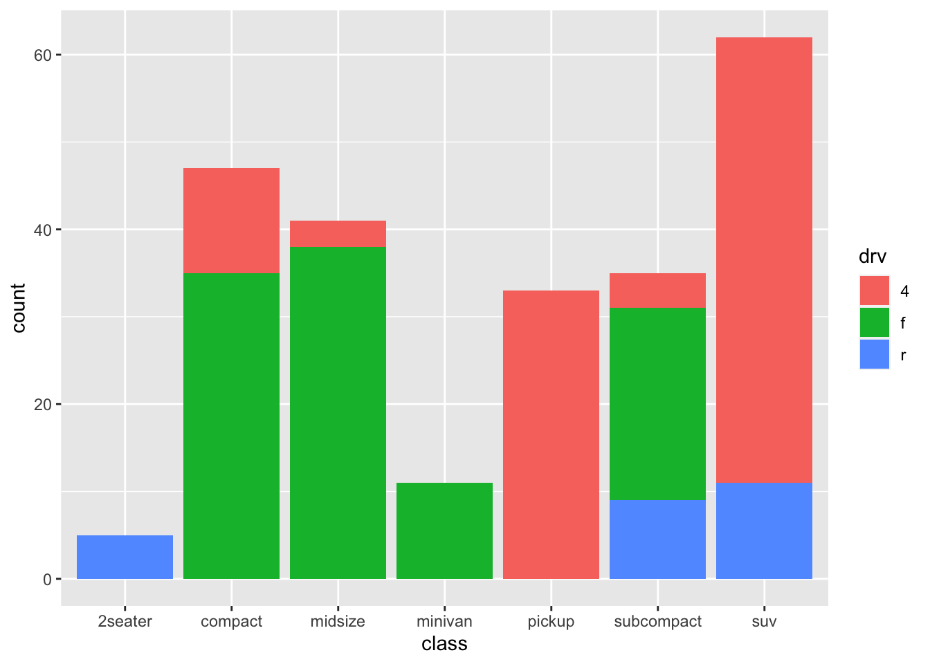
3.7 Three or more variables
We already saw this code in Section 2.1. There are other ways to visualize …
p1 <- ggplot(mpg, aes(x = cty, y = hwy)) +
  geom_point()
p1 + facet_wrap(vars(drv)) 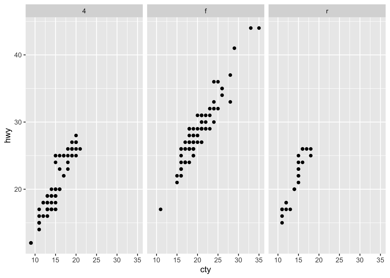
p1 + facet_wrap(vars(cyl, drv))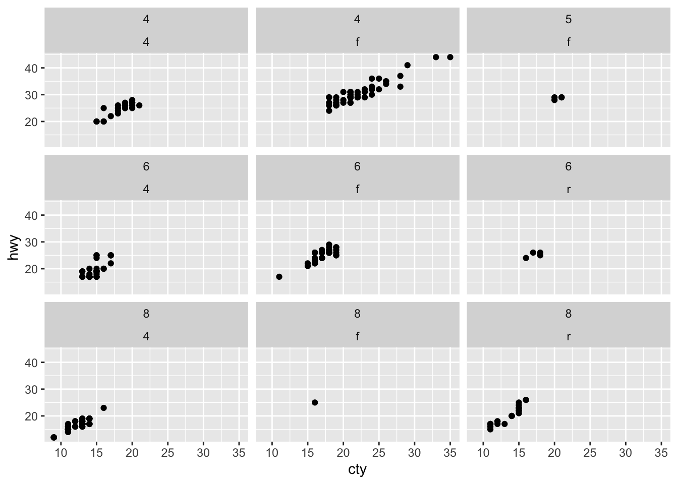
#ggsave(filename = "penguin-plot.png")