#install.packages("ggplot2")
library(ggplot2)2 Introduction of ggplot2 package
head(mpg)# A tibble: 6 × 11
manufacturer model displ year cyl trans drv cty hwy fl class
<chr> <chr> <dbl> <int> <int> <chr> <chr> <int> <int> <chr> <chr>
1 audi a4 1.8 1999 4 auto(l5) f 18 29 p compa…
2 audi a4 1.8 1999 4 manual(m5) f 21 29 p compa…
3 audi a4 2 2008 4 manual(m6) f 20 31 p compa…
4 audi a4 2 2008 4 auto(av) f 21 30 p compa…
5 audi a4 2.8 1999 6 auto(l5) f 16 26 p compa…
6 audi a4 2.8 1999 6 manual(m5) f 18 26 p compa…class(mpg)[1] "tbl_df" "tbl" "data.frame"We can see that “mpg” is a data frame, and also a tibble. A tibble is like a data frame, but with other features. Tibbles are from the package “tidyverse”.
2.1 Scatter plot: good visualization for two numerical variables
2.1.1 basic
We draw a scatter plot between “cty” and “hwy”.
ggplot(data = mpg,
       mapping = aes(x = cty, y = hwy)) +
  geom_point()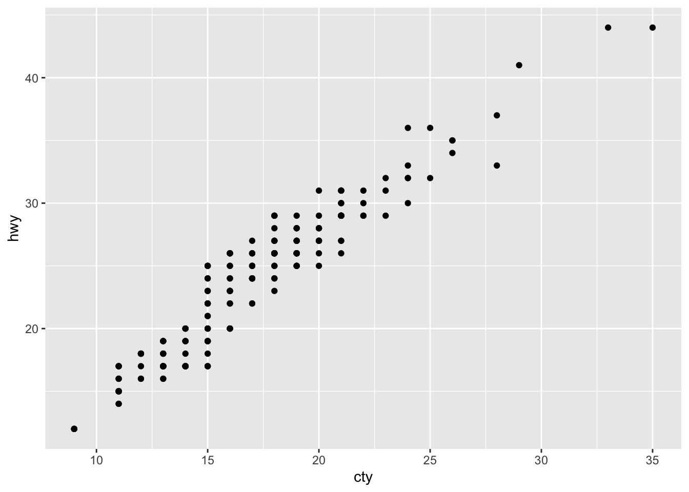
2.1.2 colored by a third variable
We can color the points by another variable, for example, colored by “drv”. This allows us to see how “drv” influences the relationship between cty and hwy.
ggplot(data = mpg,
       mapping = aes(x = cty, y = hwy)) +
  geom_point(aes(color = drv))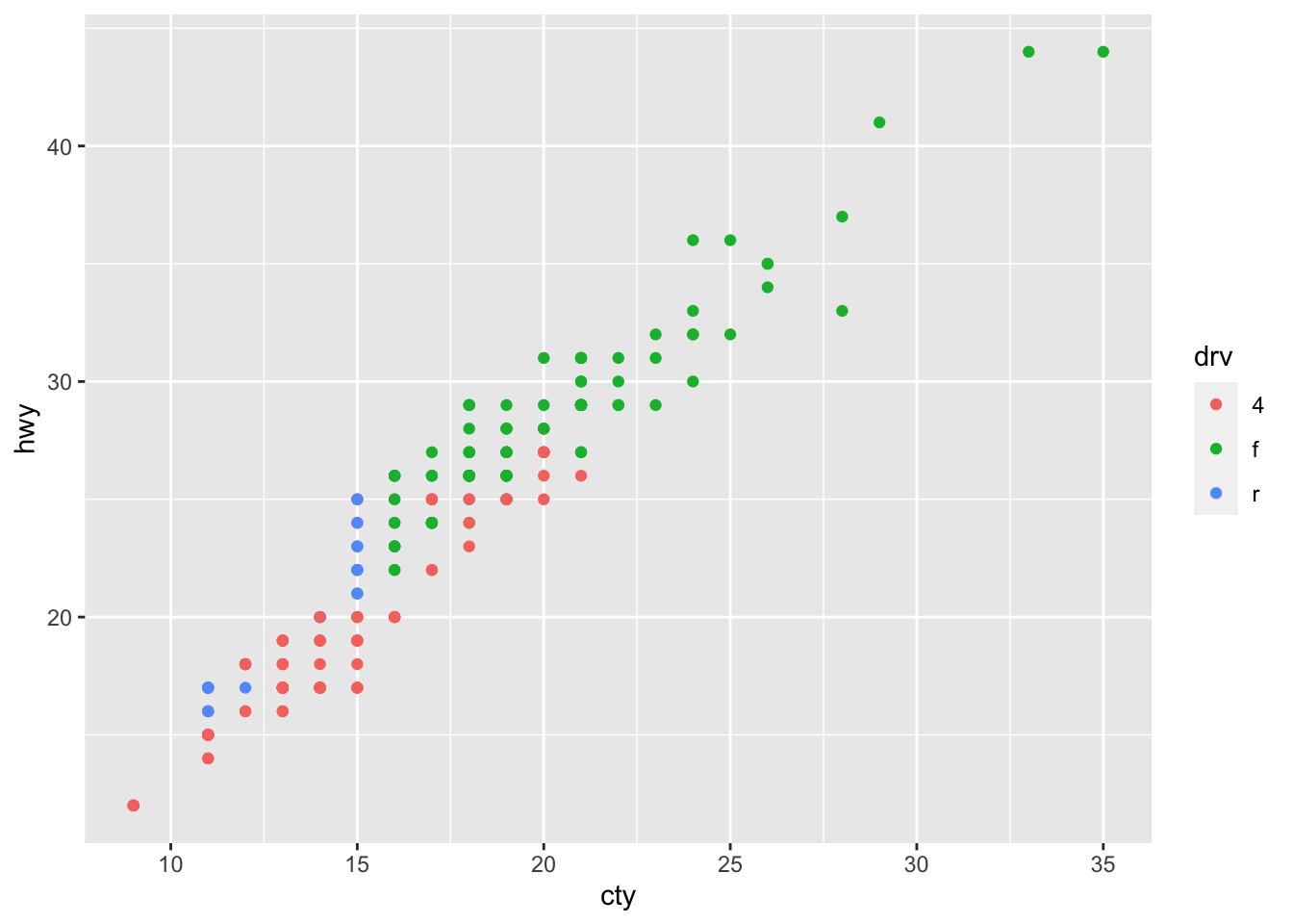
2.1.3 adding some labeling
Edit labels:
p1 <- ggplot(mpg, aes(x = cty, y = hwy)) +
  geom_point(aes(color = drv))
p1 + labs(title ="Hightway MPG VS City MPG",
          subtitle = "Colored by different types of drive train",
          x = "City Mileage",
          y = "Highway Mileage",
          color = "Driver Type")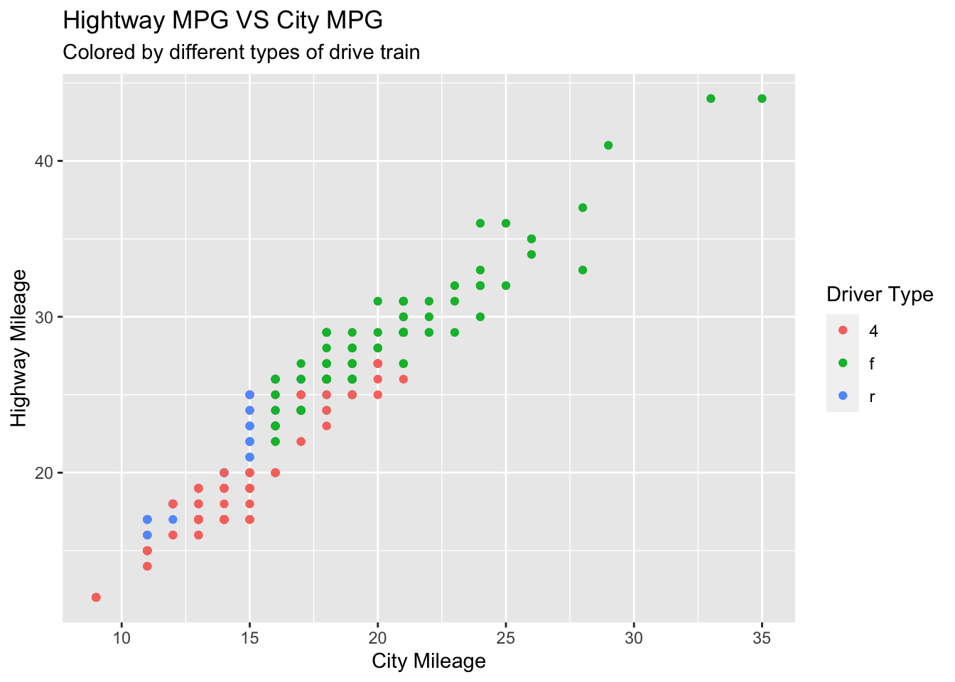
2.1.4 colored and shaped simultaneously
Sometimes we want the points colored and shaped simultaneously by the same variable.
ggplot(mpg, aes(x = cty, y = hwy)) +
  geom_point(aes(color = drv, shape = drv)) +
  labs(title ="Hightway MPG VS City MPG",
       x = "City MPG",
       y = "HW MPG",
       color = "Drive type",
       shape = "Drive type")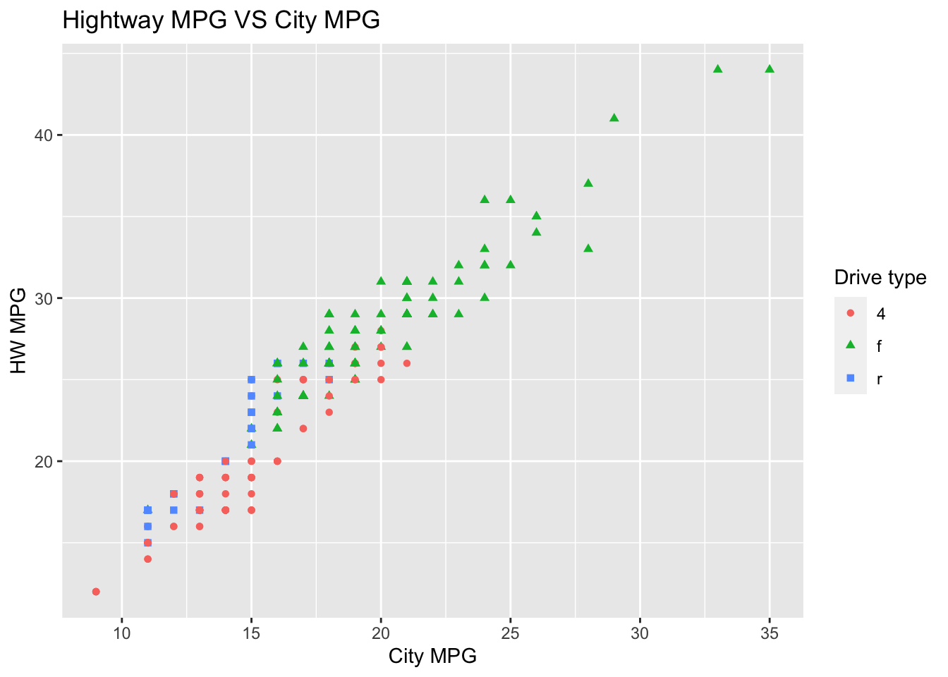
Finally, it would be nice to change the legends texts in the above plot.
ggplot(mpg, aes(x = cty, y = hwy)) +
  geom_point(aes(color = drv, shape = drv)) +
  labs(title ="Hightway MPG VS City MPG",
       x = "City MPG",
       y = "HW MPG",
       color = "Drive Type",
       shape = "Drive Type") +
  scale_color_manual(labels = c("4wd", "front-wheel","rear wheel"),
values = c("red","green","blue")) 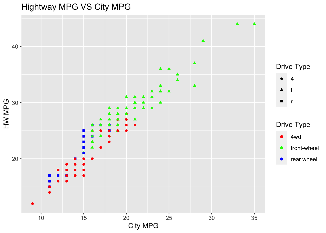
The above picture is fine, but it would be better if we can only have ONE legend since it’s the same variable “drv”.
ggplot(mpg, aes(x = cty, y = hwy)) +
  geom_point(aes(color = drv, shape = drv)) +
  labs(title ="Hightway MPG VS City MPG",
       x = "City MPG",
       y = "HW MPG",
       color = "Drive Type",
       shape = "Drive Type") +
  scale_color_manual(labels = c("4wd", "front-wheel", "rear wheel"),
                     values = c("red","green","blue")) +
  scale_shape_manual(labels = c("4wd", "front-wheel", "rear wheel"),
                     values = c(16, 17, 15))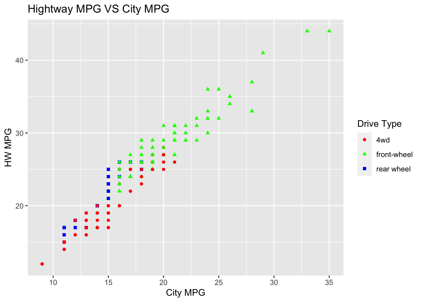
In the above code, we can see that value 16 corresponds to a solid circle, 17 corresponds to a solid triangle, and 15 corresponds to a solid square. At the end of this page, you will find all the correspondence between value and shape.
2.2 Save a plot
ggsave() is a convenient function for saving a plot. It defaults to saving the last plot displayed. Below is an example:
ggsave(“path/some_plot.png”, width = 7, height = 3.5)
This chapter is only an introduction to ggplot2 package. We will keep learning ggplot() in the next chapter.